My role
UX Researcher
Marketing strategist
Summary
Marketing strategy & UX research for a company in order to create an app that allows users to order handyman services within their area.
The project
It consist on a research process and full marketing study from a fictional brand that would feel like a real one. The objective is to create a consistent and strong research that could e later used to develop and design a marketing product with business goals.
The company
(Fictional company) GoldHand’s mission is to be the best, easy and quick method for users to find handymen within their area for inhouse or store services.
As well a tool on which handymen might grow within a community, to partner with the company, gain visibility, and encourage professional freelancing.
Business goals
Become a trustful tool for handymen to partner
The business main user database for income would be those that partner and register as handyman, to promote and publish their services. GoldHand must become a very trustful tool to appeal these users to gain as many partners as possible for increase of income.
INCOME
- 15% service fee over the works from every partners on the app.
- Offering further options to promote each partner and their service for an extra monthly payment.
- Offering further options to promote each partner and their service for an extra monthly payment.
Users core needs
There are two type of users, the possible partners (handymen that want to use the tool to publish their services) and the clients (householders or business owners in need of a service)
On this project I will focus first on the clients needs and goals to develop the frontend of the app.
Find their service needed
The users main need is to find the right person that has the service they are looking for (painters, electricians, plumbers, roofers, house cleaners, gardeners, carpet installers, tile settlers, and AC technicians) based on specific filters such as: location, availability, and cost.
feel confident on their DECISION
As natural, most users would feel hesitant for requesting a service thru a electronic list that they are not familiar with. The easiest way for users gain some confident is thru reviews, ratings, comments, and customer service that can guarantee their money back in case the work is not done correctly.
Research methods
1 Survey
2 Market competitive analysis
3 Persona study
4 User Journey
5 Process flow & Mapping
Survey
An online survey was created in order to obtain extra information that helped me on gathering key information. 50 participants filled up the survey, targeting the frontend aspects, on which would be the possible target audience.
The intentions are for me to better understand my target to create a marketing strategy as well understanding of users needs. Thanks to this data, I was able to come up with my user cases, and create personas.
The results
1 70% were women. High chance for female users.
2 There is a big change most of my user could come from the big city or suburban, so it means no necessarily this is an app only for those on rural places with lack of services.
3 There is a good range of possibility that most of my users uses internet to research almost anything, including services.
4 For the user it was given 3 options between price cost, efficiency, and quality. From the survey most users look for efficiency but pretty much the 3 of them are almost at the same range of importance.
5 A good amount of people rely on companies when hiring for jobs, which means the app as being a main company that uses help from independent person will help them to gain those customers that relies on a big title, in this case “GoldHand” something interesting is that 50% answered that they didn’t care if independent from a company as long as the person do the job faster, so efficiency and speed is taking place again.
6 The survey shows that many people trust and rely on good high reviews, so it is assure that the usage of reviews that users can see will be very helpful and appealing for them.
7 There is a good percentage of people willing to hire independent people with good reviews, which assures that the partners will get the chance to be hired. There is a 30% of users that wouldn’t trust them if they are not form a company, but as highlighted before, our members will be under the name of “GoldHand”.
8 70% of the persons on the survey decided that in case something went wrong with their work or service, they might want to place a complaint and ask for their money back, which means adding this on the app will guarantee a relief for users to see that they will get their money back in case something bad happen, as well adding option for placing complains, which would help to gather extra information from the users. As well something to take in mind of possible adding penalties for our partners when they have any lack of experience.
User cases
These are the following user cases that were thought after considering the results of my survey as well from the business and user goals.
1 Availability of services on new user’s area.
2 Earning trust on services and handymen for new customers.
3 Gathering of information for new customers before accepting or requesting the service.
Competitive analysis
I search for possible competitors that had similar services from the company. Using the user cases I went thru analysing the functionalities of 3 competitors, seeking for some pros and cons on the process on obtaining one of these goals.
This competitive analysis will later help me to gather marketing ideas and design inspiration at the moment of the creation of a product that would either compete or surpass our competitors.
1 - Availability of services on new user’s area.
Competitor 1: Handymen app
Pros
- Pre-selected cities which shows the exact number of handymen in the area.
- You can schedule events to request services.
- List of handymen, autofiltered to the search.
Pros
- Pre-selected cities which shows the exact number of handymen in the area.
- You can schedule events to request services.
- List of handymen, autofiltered to the search.
Cons
- The services are limited for certain cities.
- The search engine is confusing, outdated interface.
- The searching filters are very limited without a GPS search option nor distance tracking.
- The services are limited for certain cities.
- The search engine is confusing, outdated interface.
- The searching filters are very limited without a GPS search option nor distance tracking.
Competitor 2: HomeAdvisor
Pros
- Automatic keyword search.
- Possibility to search by zip code.
- Simple step by step search process flow.
Pros
- Automatic keyword search.
- Possibility to search by zip code.
- Simple step by step search process flow.
Cons
- Requires long time period on setting up the search.
- Not possibility to modify your search, rather to start over.
- Not real time availability, nor indication for same day service.
- Requires long time period on setting up the search.
- Not possibility to modify your search, rather to start over.
- Not real time availability, nor indication for same day service.
Competitor 3: TaskRabbit
Pros
- Address location search algorithm.
- It shows some profiles from the area.
Pros
- Address location search algorithm.
- It shows some profiles from the area.
Cons
- City limited (10 cities in the US)
- Not real time availability.
- Not GPS distance before requesting the service.
- City limited (10 cities in the US)
- Not real time availability.
- Not GPS distance before requesting the service.
2 - Earning trust on services and handymen for new customers
Competitor 1: Handymen app
Pros
- Ratings per handyman.
- Comment & review section per handyman.
- Option to call handyman before requesting the service.
Pros
- Ratings per handyman.
- Comment & review section per handyman.
- Option to call handyman before requesting the service.
Cons
- It does not show a good rating list that describes it.
- Not interface for complaints, or flagging.
- Outdated on content.
- It does not show a good rating list that describes it.
- Not interface for complaints, or flagging.
- Outdated on content.
Competitor 2: HomeAdvisor
Pros
- Basic rating options.
- Comment section from previous customers.
- You can call the handyman.
Pros
- Basic rating options.
- Comment section from previous customers.
- You can call the handyman.
Cons
- Lacks interface to place complains or ask questions.
- The rating review it only shows as overall but there is no rating for different qualities.
- Little information about the handyman with only a bio and services offered.
- Lacks interface to place complains or ask questions.
- The rating review it only shows as overall but there is no rating for different qualities.
- Little information about the handyman with only a bio and services offered.
Competitor 3: TaskRabbit
Pros
- Thumbs up interface.
- Brief comment section.
- Show price per hour for basic services.
Pros
- Thumbs up interface.
- Brief comment section.
- Show price per hour for basic services.
Cons
- Lacks profile information.
- Lacks contact methods for handymen or the company staff.
- The review rating lacks on specifications.
- Lacks profile information.
- Lacks contact methods for handymen or the company staff.
- The review rating lacks on specifications.
3 - Gathering of information for new customers before accepting or requesting the service.
Competitor 1: Handymen app
Pros
- Easy contact by phone call.
- Profile image, and personal information
- It shows payment options.
Pros
- Easy contact by phone call.
- Profile image, and personal information
- It shows payment options.
Cons
- Lacks customer service interface to request help.
- The profiles of each handymen contains very short non detailed information.
- You can not leave a message to either request an estimate nor ask questions.
- Lacks customer service interface to request help.
- The profiles of each handymen contains very short non detailed information.
- You can not leave a message to either request an estimate nor ask questions.
Competitor 2: HomeAdvisor
Pros
- Sidebar menu with an about panel to send feedback
- Possibility to request quotes before asking for the service.
- It has a bio.
Pros
- Sidebar menu with an about panel to send feedback
- Possibility to request quotes before asking for the service.
- It has a bio.
Cons
- Lacks interface for help or customer service
- The profiles lacks information that could be required as well availability.
- Just one contact method.
- Lacks interface for help or customer service
- The profiles lacks information that could be required as well availability.
- Just one contact method.
Competitor 3: TaskRabbit
Pros
- Displays basic price per hour
Pros
- Displays basic price per hour
Cons
- There is no enough information on profile neither phone number to reach the handyman.
- Confusing interface and complicated search.
- No quotes nor estimates.
- There is no enough information on profile neither phone number to reach the handyman.
- Confusing interface and complicated search.
- No quotes nor estimates.
Personas
thanks to the data gathered from the previous survey, the following personas were developed. Designing for these personas helped in making user path and informed design decisions as I had the end user always in mind.
User journey
by having my personas in mind and their needs I proceed on the creation of a user journey. This is focused mostly on the user searching for a service.
Process flow
I also created a process flow of the key task from the app: Account creation, Search, Sorting, and Booking. By going through the flow of the key tasks it helped me think through the core activities and ensure a seamless process from all perspectives.
Site map
After considering the user journey and the process flow I moved on the construction of a site map to organize the pages, information, and navigation of the app.
Wireframes & layout
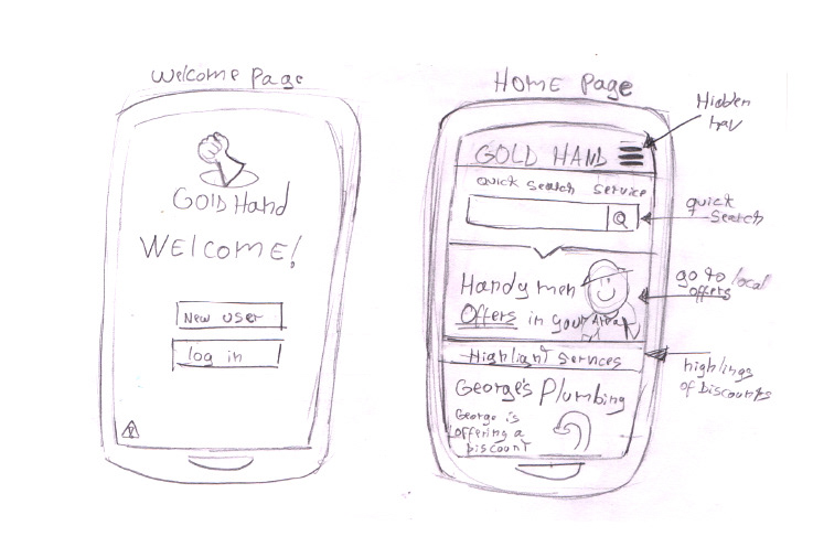
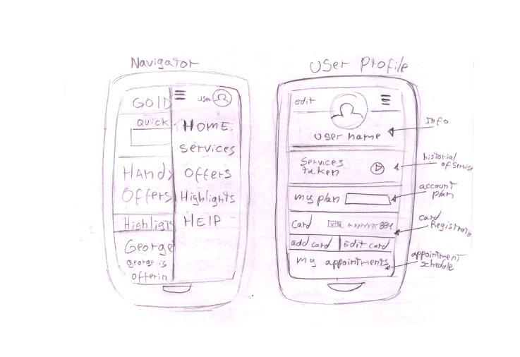
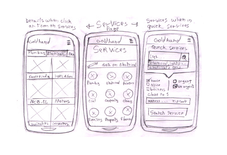
These are sketched wireframes of the app, considering layout and information display, as well some possible interfaces.
The following sketches would serve as a support for the creation of low fidelity compositions for user testing as well to consider changes to later be given to a UI designer for updated visual design.

COmpositions
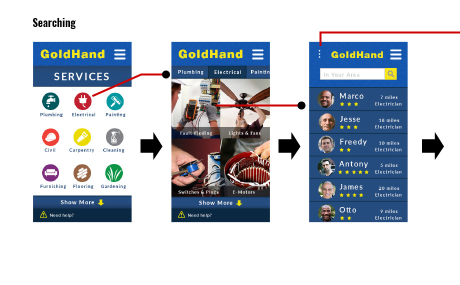
These are low fidelity compositions that were created following the process flow for simple activities on which later would be used as a prototype for user testing.
(Note that this is not the final design)

Access process
Search process
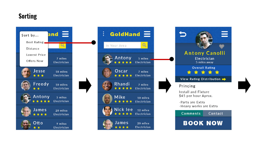
Sorting process
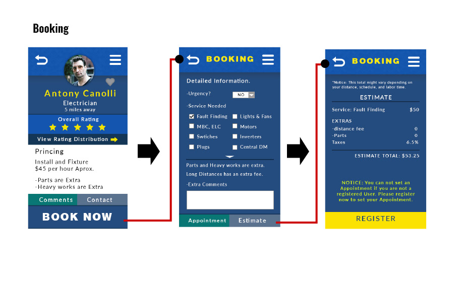
Booking process
User testing
I tested my wireframes with key tasks on a prototype with several test subjects. This helped me identify user
frustrations I needed to address in order to do changes if needed.
frustrations I needed to address in order to do changes if needed.
User testing tasks
1 Guess what can you find or do on the homepage.
2 Search for a handyman with the best ratings and near your location.
3 Ask for an estimate.
user Results
Task 1
Most of the users got a good first impression from the prototype. 3 out of my 5 users got a slight confusion on what was the difference between the highlights and the Offers. After a short explanation, they felt that it made sense and probably they would have understood it if the link was available for them to do their own user self study.
Most of the users got a good first impression from the prototype. 3 out of my 5 users got a slight confusion on what was the difference between the highlights and the Offers. After a short explanation, they felt that it made sense and probably they would have understood it if the link was available for them to do their own user self study.
Task 2
At first all of my users wanted to go straight to the search bar, but again i had to told them that it was disabled. 2 out of my 5 tried to click the link of the offers. At the end all of the users got to use the burger nav and find the link to the services. From this i came to the conclusion that maybe adding a button of the services in the homepage would be a good idea. After they opened the services they actually went straight to the default finding without any problems. Some of the users wanted to even view the other services.
At first all of my users wanted to go straight to the search bar, but again i had to told them that it was disabled. 2 out of my 5 tried to click the link of the offers. At the end all of the users got to use the burger nav and find the link to the services. From this i came to the conclusion that maybe adding a button of the services in the homepage would be a good idea. After they opened the services they actually went straight to the default finding without any problems. Some of the users wanted to even view the other services.
Task 3
2 out of my 5 users got a bit lost to find the estimate of the service but after clicking the book button they found the estimate pretty quickly. Maybe moving the interface out of the book section or adding a second one would be needed.
2 out of my 5 users got a bit lost to find the estimate of the service but after clicking the book button they found the estimate pretty quickly. Maybe moving the interface out of the book section or adding a second one would be needed.
Key learning
Since this was a personal project, I lacked communication with a developer at the beginning of the project phase to really understand the integration of the application with current POS systems. This taught me the importance of working with developers at the beginning of a product cycle to fully understand the technology you are building for.
Next Steps
Changes on the interfaces and designs according to the info obtain on my user testing, to move to a second user testing. after all changes are complete, move to the development of the app.
