MY ROLE
UX Design Lead, UX/UI designer, Researcher
SUMMARY
Website redesign following the new brand identity and guidelines.
Side project of app design for pick up orders.
THE COMPANY
Drunken Monkey is a vegan gluten free coffee bar, family based located in Orlando Florida. Their target audience is in the range of 18 up to late 30s years old, mostly within the hipster & vegan community.
PROBLEM STATEMENT
The top problem was that the website was extremely outdated. Lacking of pages and important content. It was needed to recreate a complete website that could include all the essential content needed to provide transparent information to its customers.
The hardest procedure was defining the right content and analyse what other information could be beneficial to the business and its customers.
CORE CUSTOMER NEEDS
Finding what’s right for me
With dozens of options and different dishes with diverse allergens. The customers need to feel they belong to the place and that they can choose with ease their product they desire which follows their criteria and allergens.
Gaining my trust before visiting
There are a huge amount of coffee bars in Orlando, from franchises to family owned. The customers wish to know if it is worth the trip beforehand. Google reviews was not enough of an option because not many actually go to review it. and there were very few images of the products to even look at.
The solution was the birth of a new blog community, on which loyal locals of the bar would not only share their experiences but as well commute and meet. Providing a new level of experience unique and fitting the the hipster culture aside from the standard reviews.
PROJECT GOAL
1 Increase traffic and create new users
2 Gain more visibility
3 Provide clear information
4 Remain different and unique from their competitors
RESEARCH METHODS
1 Customer interview
2 Market research analysis
3 Content taxonomy
4 Information Architecture
Defining Content & Information Architecture
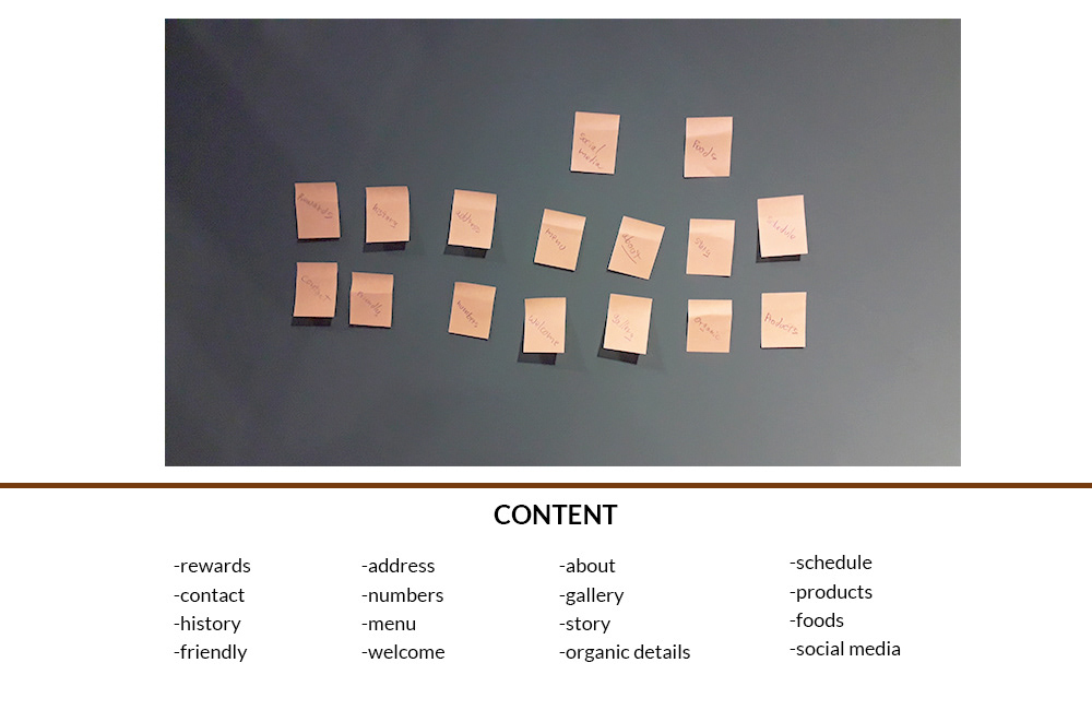
Starting from the owners of the business I started gathering some key content that was needed to accomplish the goal of providing information.
Just to make sure no blind spot was left behind I proceed on interviewing some of their customers to gather information that perhaps the owners did not think of.
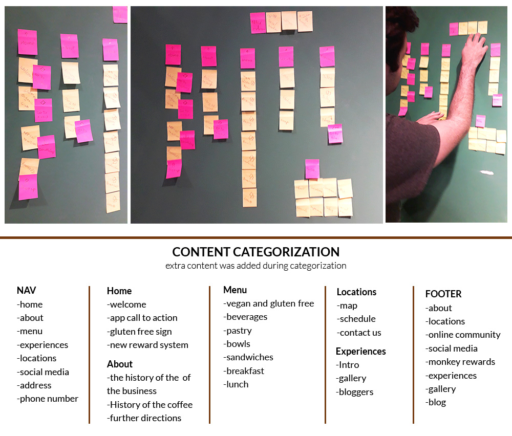
The more I was moving on the categorizing my content I was finding more missing spots on which later i proposed to the owners.
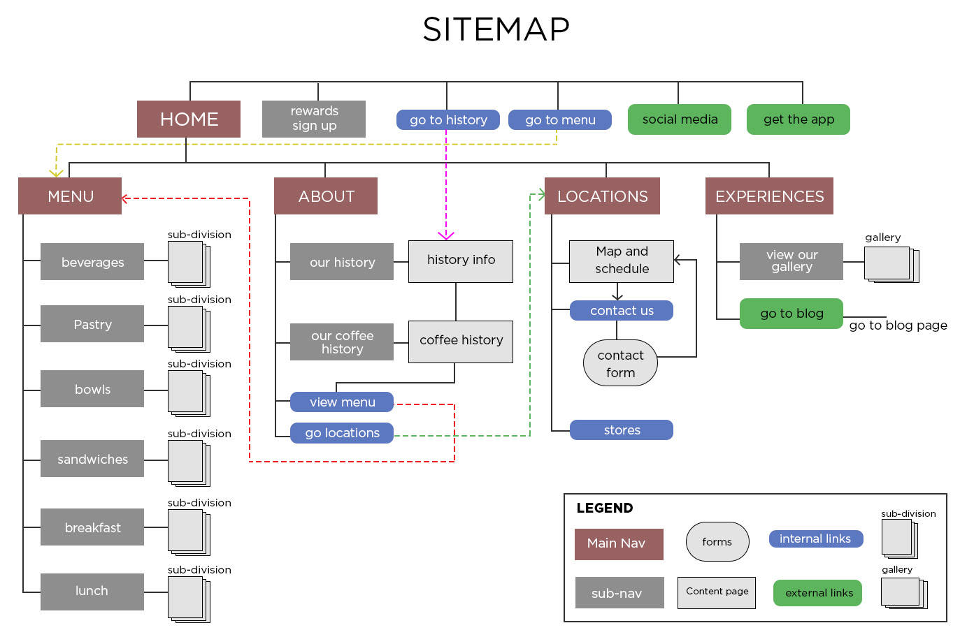
Moving on diving deeper on connecting all the content to guarantee a flexible and intuitive navigation thru the whole site.
Focusing on the customers needs I was able to narrow down the proper content and how to correctly display it for them.
web aspects & wireframes
Once the content has been defined as well the information has been structured thru site mapping I moved on creating their web aspects for the UI that would follow the brand.
As well on this stage of the project I started creating hand drawn wireframes to consider how the information would be displayed in a way for easy readability. By the moment I had a layout on which i felt was appropriated I moved on gathering feedback from the client.
Once the layout was approved i would move into creating high fidelity compositions that later the client would use to send for web development.
FINAL COMPS

Home page

Menu page
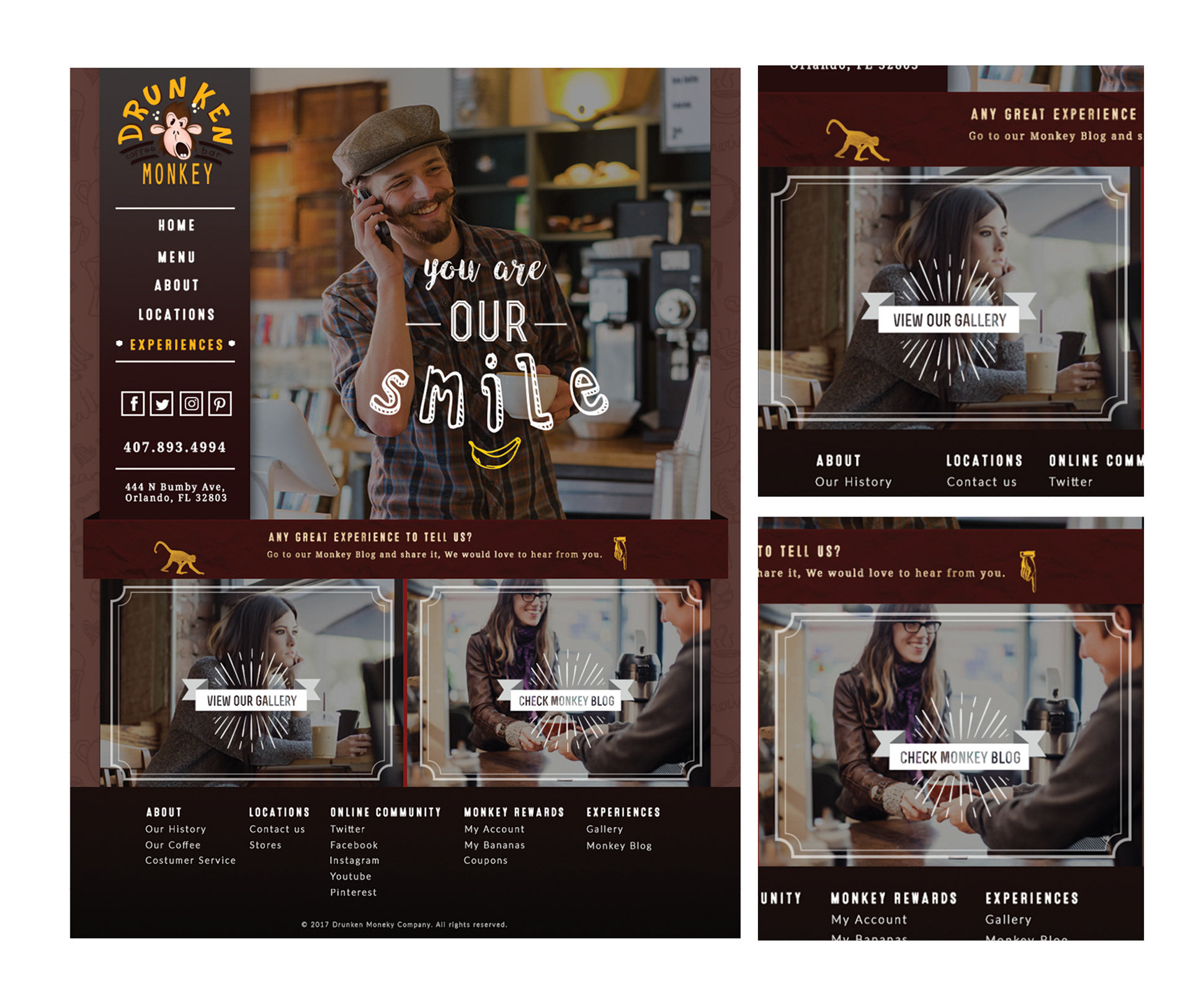
Experiences page

About page
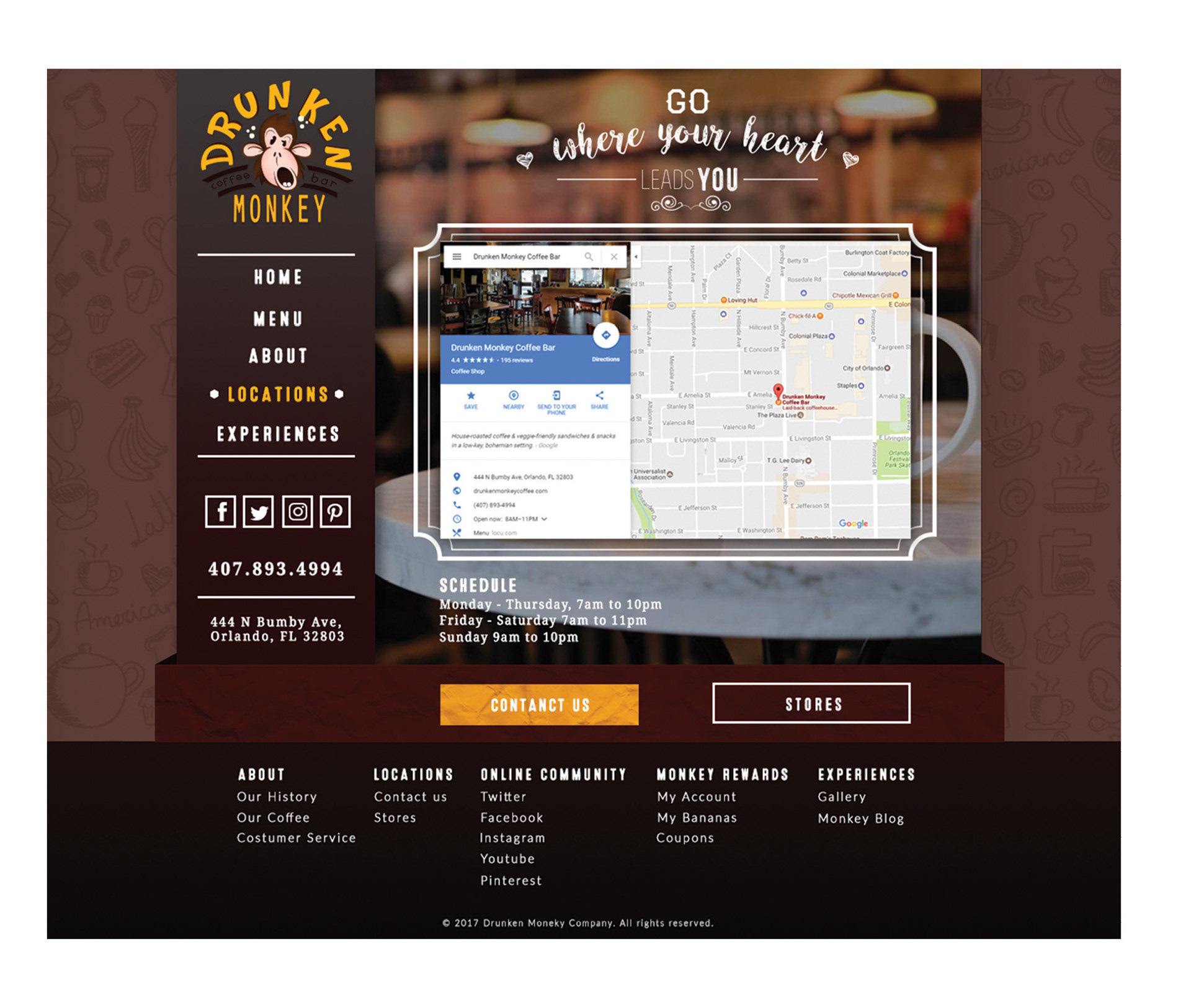
Locations page
APP SIDE PROJECT IDEA
While on the creation of the website, an app idea was born. I thought what if there were an app on which would allow the users to pre-order via mobile for pick ups or dining in. This way customers who do not want to wait for the preparation time or avoid the waiting line could arrive to the place with their food ready to dig in, while providing the user different payment methods or the option to smart pay or at the bar on their arrival.
PROJECT GOALS
Business goal
Since this was a personal project idea, I created a fictional business goal in order for me to carry on the full process on which keep in mind. The business goal would help on increase their target audience, its customer range and a new traffic on which would be call smart users. This app would as well improve the business cash flow, and increase their visibility.
User Goal
The user goals would be to save up time by pre-ordering food without waiting on lines or for food to be prepared, easy multiple payment methods, with an incentive to obtain rewards or points by each order.
user SURVEYs & results
Before even diving into the the creation of a user flow, I firstly gathered extra data thru interviews done to the customers at the coffee bar. this helped me get a better understanding of their current customers as well human mentality when ordering and how to help them improve their experience. These are some the key take away from my survey.
1 Most of my interviewees were college and university students, and some few locals with stable jobs.
2 Most of the interviewers complained about the time delay when ordering, plus the fact the bar only had one cashier.
3 When asked what was one of the most important part of ordering multiple order, many point out the fact of being specific with their orders. Meaning a great importance on customization of their orders.
4 When asked about a possible app on which they could pre-order all of them showed big interest, but moving to the question what would they wish to know when making their orders, they all answered the time for them to arrive and plan their schedule or if they could set up and specific time for pick ups.
PERSONA
Based on the research found on my discovery period of the project a persona was developed, Sarah. Designing for Sarah helped in making informed design decisions as I had the end user always in mind.
USER JOURNEY
Keeping Sarah in mind, I mapped her user journey from planning to obtain her pick up order. Understanding her decision making and flow within the pick up ordering experience allowed me to brainstorm the necessary features and opportunities required for Sarah to successfully navigate through the app thru a process flow.
PROCESS FLOW
Considering my user journey I moved on the creation of a users process flow on the main task of ordering something from the menu, customizing it and setting it up for pick up at certain time.
In this following diagram shows the steps a new user would take from register up to getting a cappuccino to pick up:
INFORMATION ARCHITECTURE
Considering my user journey I moved on the creation of a users process flow on the main task of ordering something from the menu, customizing it and setting it up for pick up at certain time.
In this following diagram shows the steps a new user would take from register up to getting a cappuccino to pick up:
USER FLOW & WIREFRAMES
Once the process flow was defined and I created a reliable info architecture for the app I decided moving forward on creating simple wireframes on which would help me to recreate a user flow to make sure its flow was straight forward, intuitive and without complications.

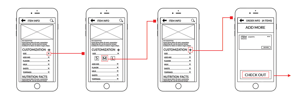

USER TESTING
I decided to pick some users from the coffee shop, on which 5 were willing to take the test. The following are the tasks given and its results:
User testing tasks
1 Search for one item on the menu and read its description.
2 Customize the item and add to the order.
3 Check out the order, by choosing the nearest place for pick up, and complete the process.
User results
Task 1
All test users were quick to access to the main menu, browse thru the nav to find the Menu section and pick the first item on which they could easily read its description.
Task 2
For all my test users were easily able to customize the size of the item of the order, but all had a problem on adding the item to the cart dude to the interface was not clear for them.
Task 3
Once all users were explain the option to add the item to the cart they all felt the following task was very straight forward. They all easily went to the check out area, picking the nearest location, and chose the option to be a pick up and proceed to pay. Some interesting feedback from the users was that 3 of them mentioned that it would be more convenient to first pick the option of pick up and after choosing the place.
Final result & comps
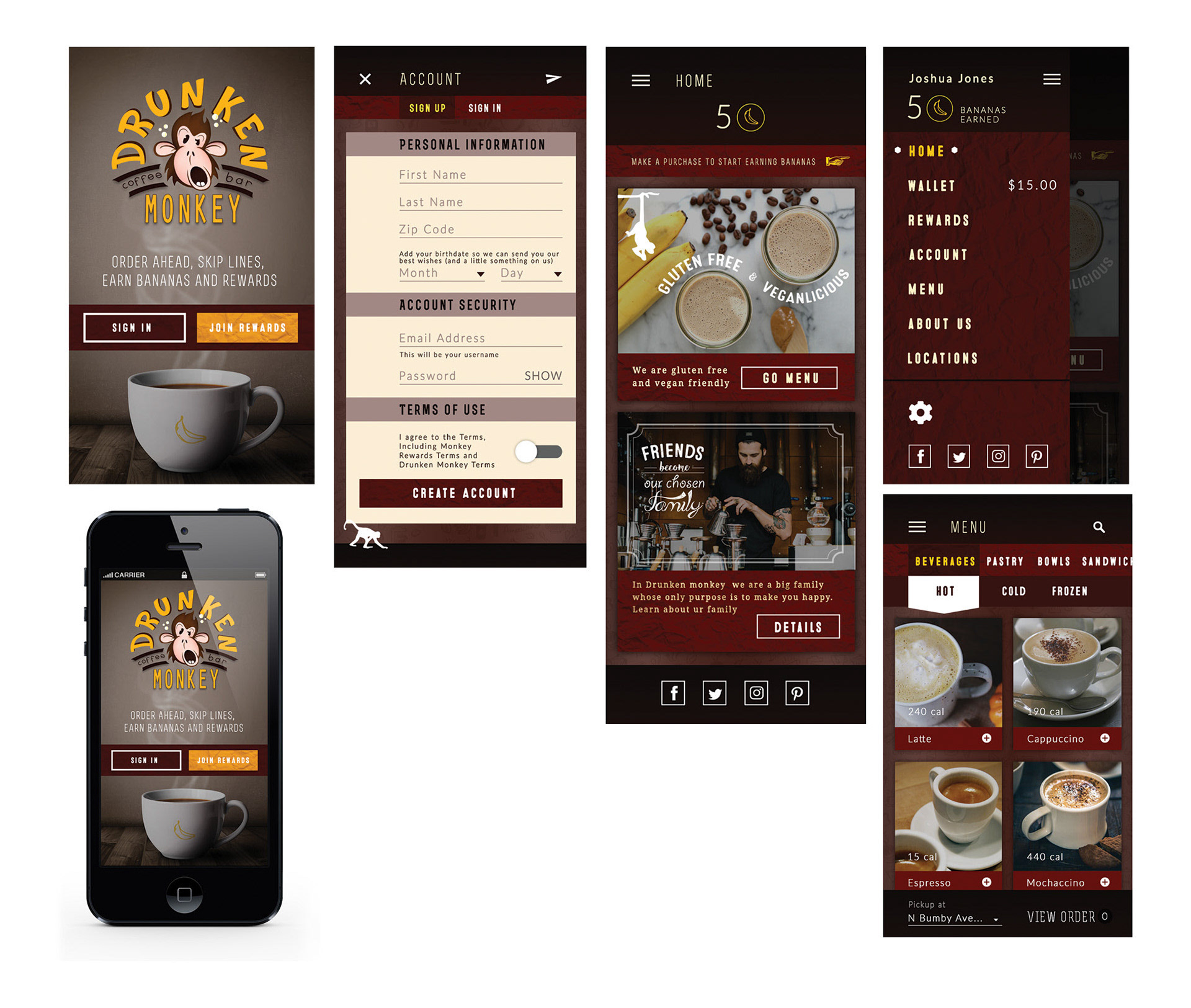
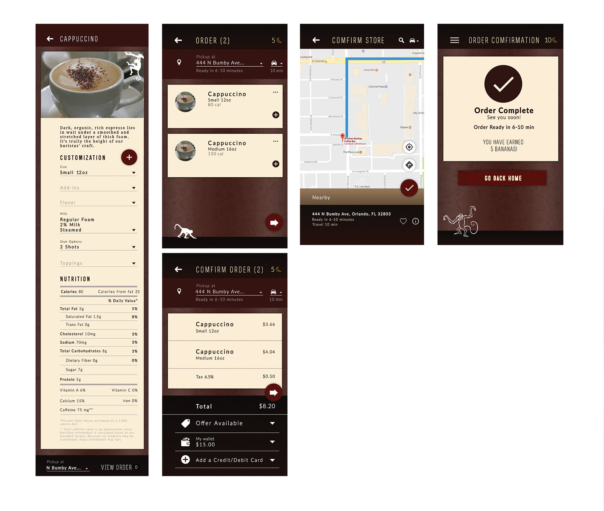
Thanks to my results on my user test I was able to do some minor changes and went again on prototyping and user testing on which lead me to more positive results. After I proceed on its visual creation, interfaces and overall look of the app thru some high fidelity comps.

WHAT'S NEXT?
If this app would become into reality, my next step would be getting together with a developer in order to reconsider the whole UX & UI study in order to pin-point possible technology problems, most likely we would reconsider some few changes for a final user test and move forward to development and delivery of the final product
Want to see more about this project?
