Role
UX/UI Designer
Project Prompt
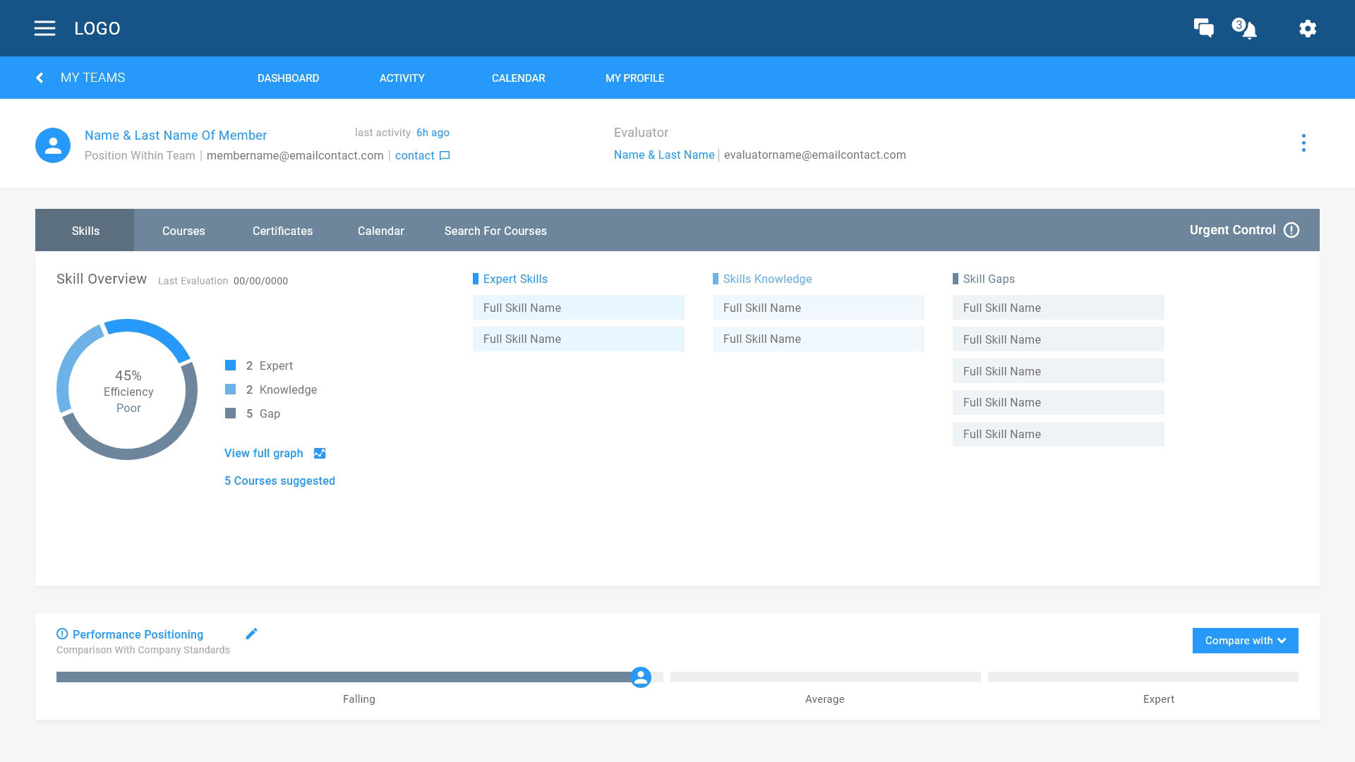
Visually redesign the E-learning managing platform for company trainers.
Company brief
DO-cebo, aligns the training needs of organizations to those of their learners that uses learning-specific Artificial Intelligence (AI) algorithms to produce more immersive and more effective learning experiences. Recognized for its ability to satisfy multiple use cases for both internal and external enterprise learning.
problem statement
Our training managers from diverse scenarios and demographics are in need of an improved intuitive and linear managing dashboard that help to monitor a team's knowledge, experience, and efficiency, as well activities, trends, skills gap, performance and quality work, because the current one brings frustration due to its unclear language and difficult navigation.
Project Vision
For this project the goal was to be user focused, target pain points and provide the best info architect solution for training managers overview deficits, communicate with the trainees, target gaps and provide best 1 on 1 mentoring.
Challenges
1) Quick team overview of performance and efficiency to take action.
2) Individual focus per member for 1 on 1 mentoring.
3) Planning and scheduling with ease for groups or singular.
research method
1 Kickoffs
2 Interviews
3 Personas & Affinity maps
Audience
Managers, trainers, training managers of all genders from ages 25 to 50.
Focused devices
Desktop, since it is the main device used by our users.
Meet our Persona
Thanks to our interviews and insights we created a set of personas with different scenarios to help us maintain the scope of the project.
Meet Katherine, one of our training managers. Personas like katherine helped us to reveal pain points and come up with hypothetical needs.
Hypothetical needs
1) Our managers may need an clarification from the trainee to understand the gaps.
2) Our managers may be need to create private sections to certain trainees in order to improve the team performance.
2) Our managers may be need to create private sections to certain trainees in order to improve the team performance.
3) Notifications may be beneficial to take quick action on efficiency drops. These notifications could be customizable by managers needs and criteria.
Pain points
1) What actions should the user take when an alert of drop appears?
2) The impact from time vs result tracking
3) How much pressure can managers apply to trainees to avoid high levels of stress and falling back?
4) What if trainees do not keep the data updated to the managers?
User journey
With the help of our persona we decided to make her user journey on the necessary steps for managing a team performance, while keeping in mind her frustrations and goals, as well as our assumptions and constraints.
Preliminary taxonomy & flow
Once tasks and goals have been defined we started to ideate the content taxonomy of each section. Later we created detailed user flow from start to finish journey on managing a team performance.
This helps us in understanding ways users can interact with the product, as well as allowing us to see navigation through user goals, as well tackle down pain points.
Lo-fi Ideation & wireframes
Once content and flows has been validated this was the key moment of the ideation by sketching P&P wireframes with different variations that met the user goal and display the flow. After selecting the best layouts, they were translated into digital wireframes to be used as alpha prototype


Alpha Test & Pre-validation
With collaboration of stakeholders and colleagues, we impersonated different scenarios and users to complete a series of tasks of the journey to identify gaps on a team, search for courses, evaluate performance, communicate with a trainee and set up mentoring appointments.
With the use of of their feedback and results of their actions during the test, I considered areas for fixing and improvement. These changes were done while creating the high fidelity mockups that would be later review once again on a different batch of users to test and compare results from the subjects on the previous test.
high fidelity
After successfully user testing, I moved on doing some changes on and creating some high fidelity mockups. Taking in consideration that this design would work visually i decided to even choose different main colors to test the diversity when an organizations customise the platforms to look closer to their brand identity.
