CLIENT
Valencia College - Student Magazine Publication
BLAM!
MY ROLE
UX/UI designer, Researcher
SUMMARY
Create an app as electronic magazine which is constant updated with new articles from the physical copy of BLAM! magazine.
Create a new community of online readers for future offers.
The company
BLAM! , the magazine dedicated for the geek and comic lovers. For those that want to remain updated with a mix of interviews from famous comic writers, comic conventions, tips from popular cosplayers, and many reviews and suggestions for comics to read and obtain.
Problem statement
BLAM! magazine as keeping a huge amount of articles and reviews, it has become hard to choose and discard some for the print version.
Other problems could be if readers would get attached quick to the app, creating a new community and how make its search flow easy for users to find all kind of articles from such vast amount of data.
the solution
BLAM! app would be a small library of articles and comics but its appeal would be the possibility to be fully customized. To bring further appeal to the app version, users can stay connected and feel within a community of other peers with similar interests on which they can share their opinions and obtain e-comics.
CORE USERS NEEDS
Find new articles regarding the comic universe i like
The we contains a huge vasts of articles, and BLAM! magazine as well contains a huge library of articles, interviews, and reviews from all different brands and comic universes. BLAM! guarantees on providing the right information for its users, but a well planned and specific search flow is needed to achieve happiness for each user.
save on my favorite news
On top of finding the right articles for the readers, it would be quiet important so that the users can save their articles either to read later or for further personal investigation.
gaining my trust from other readers
There is a huge amount of professional reviews on the web as well the ones provided by the brand. But something that has become common between the new era is that users and consumers rather read reviews from personal experiences rather from professional ones. BLAM! allowing for users to leave their own feedbacks would help for other users to gain trust as well creating a stronger connection to the app.
read comics
As simple as the statement. These users are comic lovers, and they wish to read their favorite comics. But sometimes carrying around a print copy can not only be complicated to carry but also run the risks to damage such print copies that are highly valuable on the hearts of the readers, specially for comic collectors.
Business Goals
Offer a free platform of daily articles with an interactive community that can share opinions. Even though the news service will be free, it will also provide the option to users to subscribe for a small fee to receive the print version of the magazine and the opportunity to collect and read e-book comics while the subscription is active.
Income
would come from users that subscribe for a small fee either monthly or yearly to get the print copy and download e-books.
PROJECT GOALS
1 Guaranteed search flow for articles on different libraries
2 Personal profile and library customization per user
3 E-book comic library to online read.
4 Gain the user's trust from a community
research methods
1 User interview
2 User journey
3 Content taxonomy
4 Information Architecture
5 User A&B testing
USER INTERVIEW
Before even diving into the features, i started my UX research by conducting some user interviews to learn more about their problems and common factors. Some of our interviews included friends and classmates from the comic community fan club.
KEY INSIGHTS
1 Organizing e-books or online articles for the users is an stressful task, some might lose track of their information from the amount of saved articles.
2 Search tends to be dedicated hours for users to find an article that would interest them, specially since in the comic community there are many different topics, comic universes, interview, and trends.
3 Online comics are a big deal today for comic readers, since they can read and obtain faster their comics at any time and anywhere without damaging their print copies. But sometimes for many users can be a struggle to read new comics or versions without knowing if they will really get into it. Sometimes there can be even a struggle to find something new after finishing their favorite comic series.
KEY EXPERIENCE PRINCIPLES
1 Organization: letting users to reorganize and create different libraries that can be easily found, identified, and customized.
2 Accuracy: allowing the user to make a very accurate quick search on their topics or articles that will save and bring a nice experience during their search period.
3 Confidence: The addition of reviews not only from the BLAM! crew and other professionals, but also from other readers will benefit users to view the articles, and possibly share them with their peers. Reviews on comics will bring extra confidence and help on decision making for readers to choose and obtain a new e-book.
PERSONA
During my research period of the project a persona was developed to achieve the goals of this project, Braian. Designing for Braian helped in making informed design decisions as I had the end user always in mind.
USER process JOURNEY
Keeping Braian in mind, we mapped his user behavioral flow from searching for articles to obtaining new comics. Understanding his decision making and flow within his search experience allowed me to brainstorm the necessary features and opportunities required for Braian to successfully navigate through the app.
DEFINING CONTENT & content taxonomy
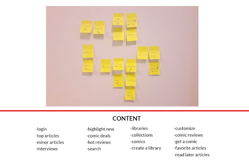
After analyzing Braian's process journey I was then able to narrow down for some key features via card sorting that would achieve the project & user's goal. Later i moved on categorizing and arranging how these features should be portrait in order for information be delivered in a efficient way to users.


Once i had my content categorized my team and I moved on a content taxonomy mapping in order to organize the data, libraries and where to store them.
Information architecture
After finalizing the content procedures, my team and I created several sitemaps for the app, for us to have a better visual representation on how to connect and interlapse the information that could guarantee a continuous flow.
user flow & wireframes
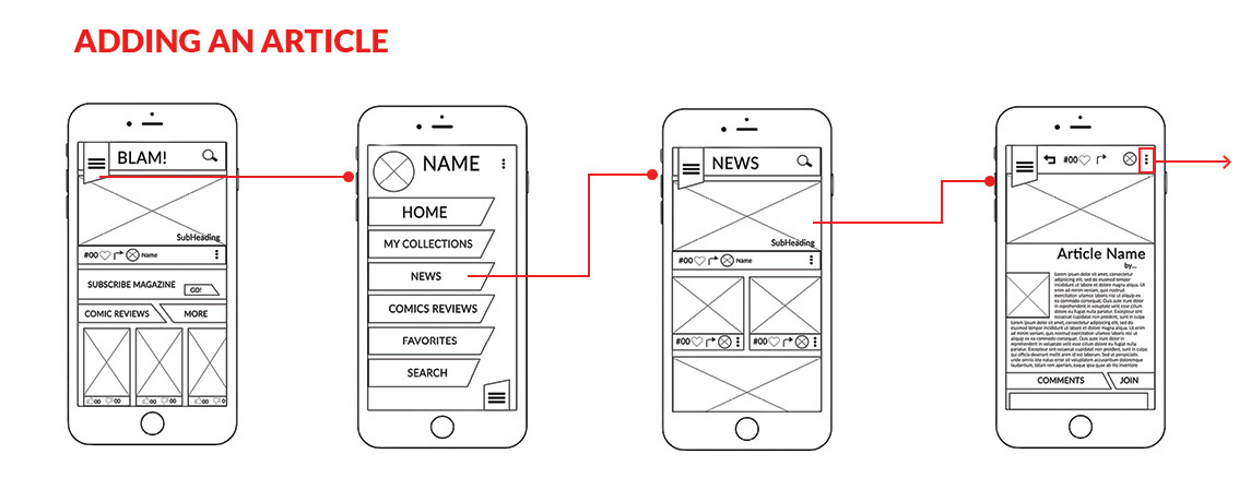
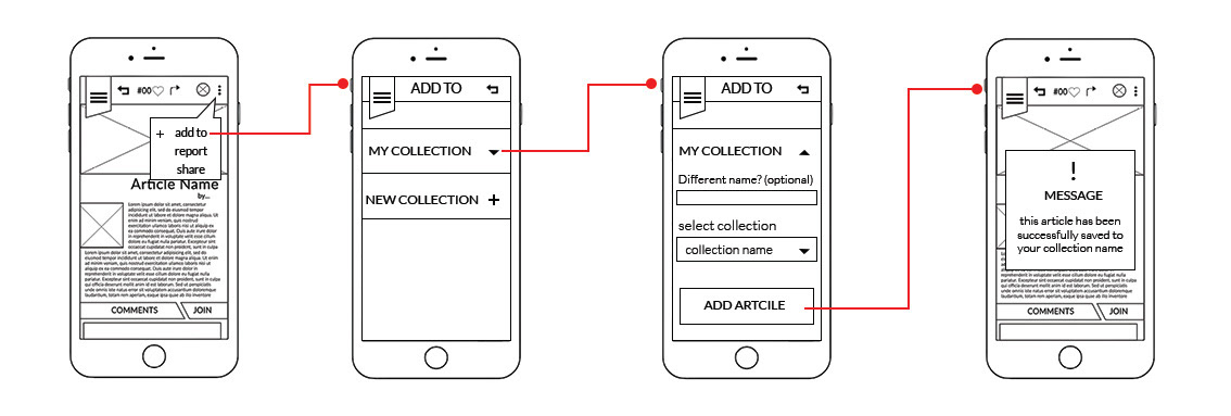
Using everything gathered from our research and utilizing the sitemap as our guide, I moved on recreating some lowend mockups of a flow of key activities. Using these lowend mockups, we created a prototype for the next phase.


USER TESTING
I decided to pick some users from Valencia College that were on the comic fans club and showed them the first version of the app. I asked for volunteers to run a test on which 10 were selected for A&B testing different solutions on the flow. The following are the tasks and its results.
User testing tasks
1 search for an article from Marvel universe.
2 Add an article by creating a new collection.
3 Search for a comic and its reviews
User results
TEAM A
Task 1
4 out of 5 from the users tried to use the search interface at the home page. Once there they used the search interface and typed the keyword Marvel they opened the first article that was available from their search.
Task 2
We were deciding either placing this option inside the extra options interface or rather having a quick interface outside. For this team we placed it inside the more options interface. For our surprise the whole team went straight to the option from its panel and then created a collection to add.
Task 3
Perhaps the easiest task. Most users went straight to the comic section, used the filter to search by high ratings. Then they would open the comic they found interested and went to check for the comments from other readers (which at the moment where fake comments for the sake of the test)
TEAM B
Task 1
3 out of 2 from the users went straight to the menu to access the news section. while on the section they used the search bar with the keyword Marvel Once there they used the search interface and typed Marvel and opened the current article available.
Task 2
We were deciding either placing this option inside the extra options interface or rather having a quick interface outside. For this team we placed a visual interface of a "plus". Only 2 of the team used this functionality while the rest took a longer trip by going to the collections section, creating a collection and adding an article.
Task 3
For this team we rather tried a filter of search by higher visibility. Then they would open the comic they found interested and went to check for the comments from other readers (which at the moment where fake comments for the sake of the test)
FINAL results & comps
Thanks from our test results we managed to gathered the information needed for final decisions. I later moved on creating a fitting style guide following the brand style and adapting them for mobile version.
I moved on introducing the style and the adequate interfaces for the app. I created a basic high end prototype for the crew and product manager to text and give final feedback.
Conclusion
The app was later sent to developed and went under further tests and constant track to see its performance and number. The app being a college app ONLY was actually a success and as been growing ever since with subscriptions and even te print version has been increasing more.
Key learnings
Teamwork was a big key factor on this project, on which as my role for UX designer I had to be connecting with the other members of the team, following requirements. Big key learning from this project was the intense research in order for us to obtain the right information and create a modern and simple user flow that would achieve the users needs. At last the importance of being in touch with the developers to make sure every interface and info architect that was being developed and planned was fitting for later to be developed.
Want to see more about this project?
